Project Overview
Segal is an online trading platform for buying and selling stocks. It helps users carry out stock market transactions in a smart, user-friendly environment. The Dev team had already developed the backend and infrastructures, and the design team was responsible for developing a suitable user interface for this application.
Team Members:
Hossein Sharafi : Senior Product Designer
Arta Mokaberi : DesignOps
Date: 2019 (4 months)
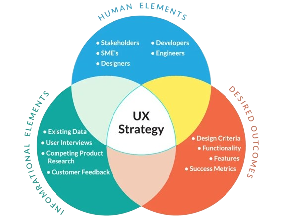
UX Design Strategy
We met with stakeholders, product managers, and the marketing team daily to extract customer needs and understand what constitutes customer value. During these meetings, user needs were extracted and recorded as SRS documents.
Since this project was an MVP and the launch time was very close, extensive user research was not possible. We were limited to the information collected by the marketing team and some interviews with users who were using competitor platforms.
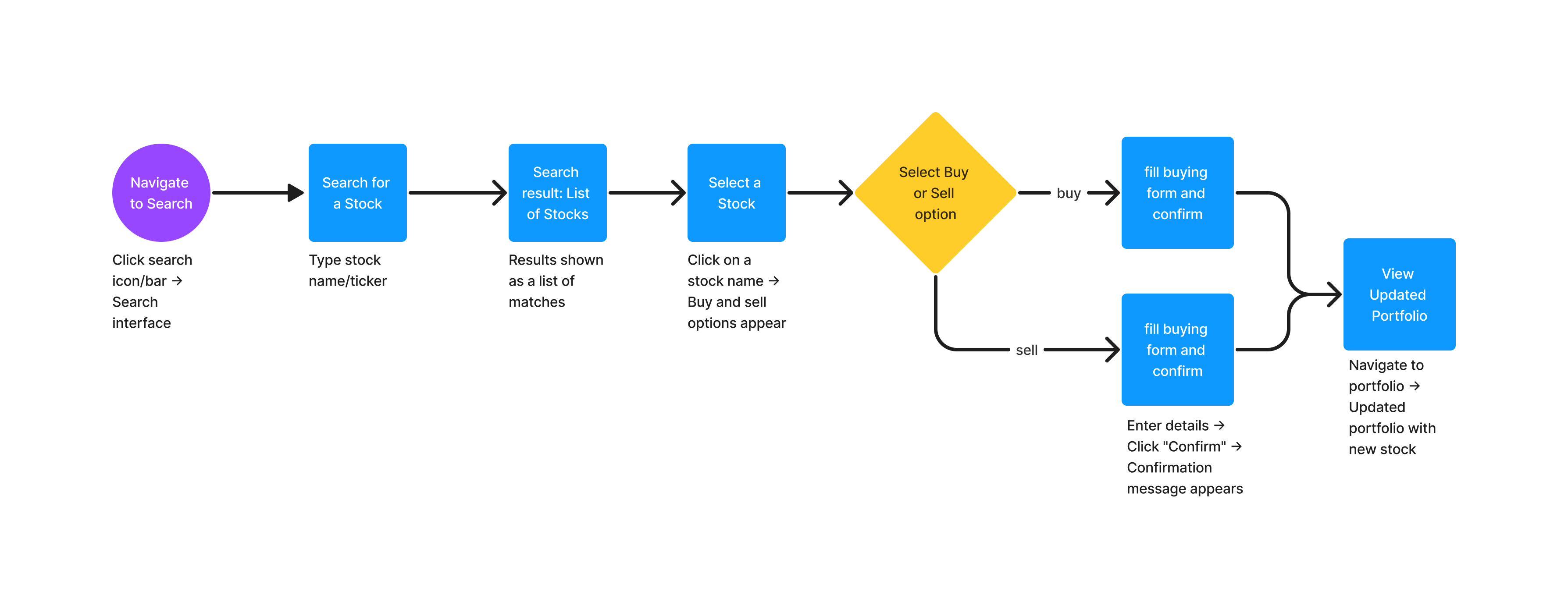
User Flow and Information Architecture
As the backend part of the software was already designed, I had to design a user interface based on the existing software and the current stock applications available in the market. I had several meetings with the product manager to understand how stock market software works and to determine the best user flow for our users.
Buy and sell Stocks User Flow
Navigation System Analysis and Design
After examining the rivals, we reached two universal UI paradigms for these complex systems:
- The Frames Model is a user interface with side-by-side boxes that may be moved about and arranged differently depending on the user’s needs.
- The Pages Model: In this approach, every necessary user interface module is implemented on a different page, and the layout of the pages cannot be changed (except in the viewer section).
We decided to proceed with the framing model because of the complexity of the platform we were working on and the requirement to let the user modify the environment. All subsequent works and user interface decisions would be impacted by this decision, and all additional pages should be created and implemented using this structure.
Multiple meetings with Segal’s front-end team were held to see whether the developers could implement this design.
Developing the Design System
The user interface design process in Figma started with the establishment of a Design System, which was in accordance with the technical team’s requirement for an integrated system of elements and components.
To create the design system, each UI element was designed separately, and its user guide documentation was shared with the other UX team members in a separate file in Figma.
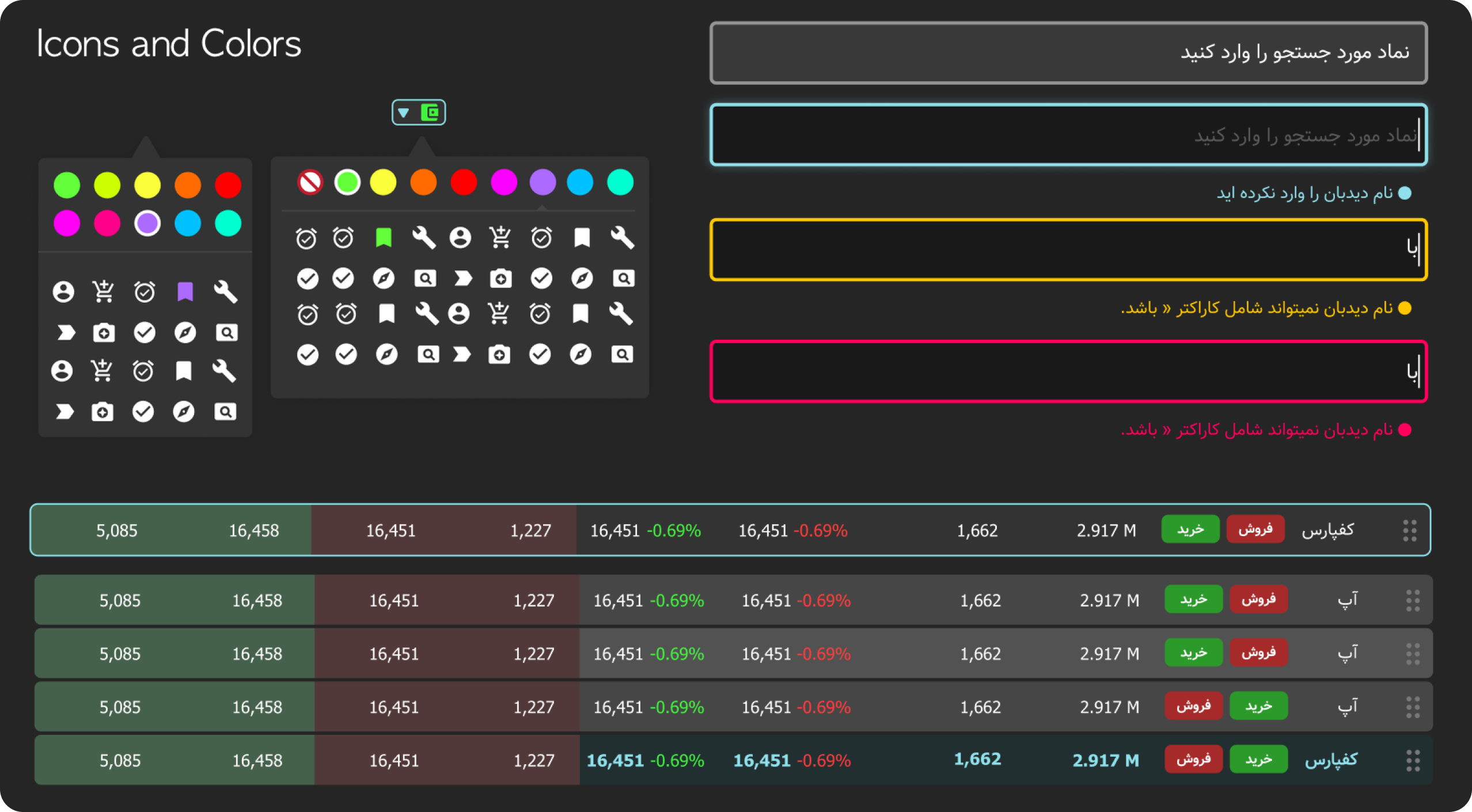
Choosing the right color palette
We looked at various international stock exchange platforms, including Ctrader and Bitfinex, to find the best color scheme for this product. Finally, the current dark color scheme was chosen based on the project requirements, client consultation, and the desired graphic innovation for this product.
For this project, two other themes—light and dark—were also developed so that customers who are not accustomed to the default color scheme can alter the theme of the user panel and make it more aesthetically pleasing to them.
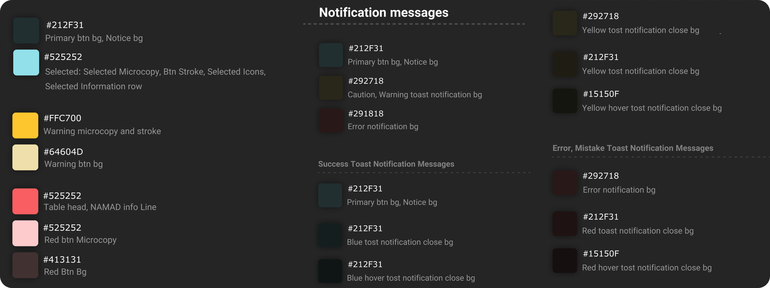
Popup Boxes
Popup messages have two buttons for user decisions. One button is primary, and one button is secondary.
Toast Messages
A toast message, which appears in the upper right corner of the screen, is a summary of the procedure.
Toast message notifications momentarily show on the screen. These notifications shouldn’t interfere with the user’s experience and after a brief period of time disappear without the user’s action.
• The toast message can only contain 50 Characters, including spaces. If more than 50 characters are needed to convey the message to the user, it must appear in another sort of notification message.
• A “close” button may be included on the toast notification. Users can click this button to close the toast message instantly.
• This message won’t close immediately if the user’s mouse pointer is over a toast notification.
After removing the mouse pointer from the toast notification’s area, the notification will be closed in 2 seconds.
• Only one toast message can be displayed at a time, and the next test message will appear on the screen after the current toast has disappeared.

User Interface Design
We chose to use FIGMA to develop the UI after considering the project’s design requirements and the requirement to apply the system design. For the implementation of the design system, this tool offers more comprehensive features than rivals. Additionally, because Figma is cloud-based, it is possible to design collaboratively (with two or more designers), allowing our design team to work on this project’s layout simultaneously.
This product was not just another UI design project. It was a complex system that required designers to learn how the stock market works. Several hours of meetings with the marketing team and developers were held to ensure that the final user experience could meet the user’s needs.
The pages that were created for this product are displayed in the section below.
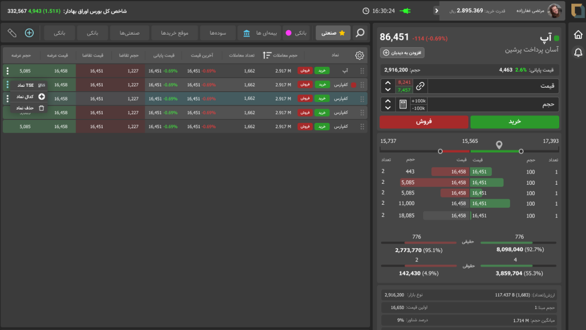
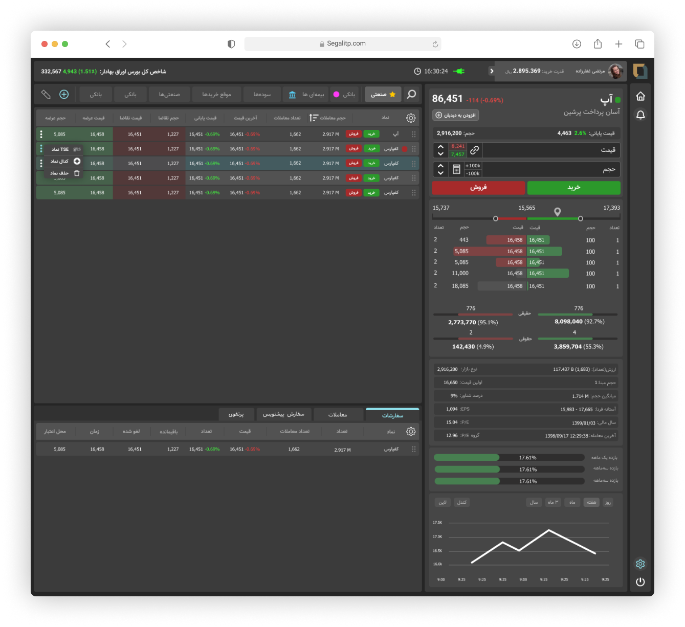
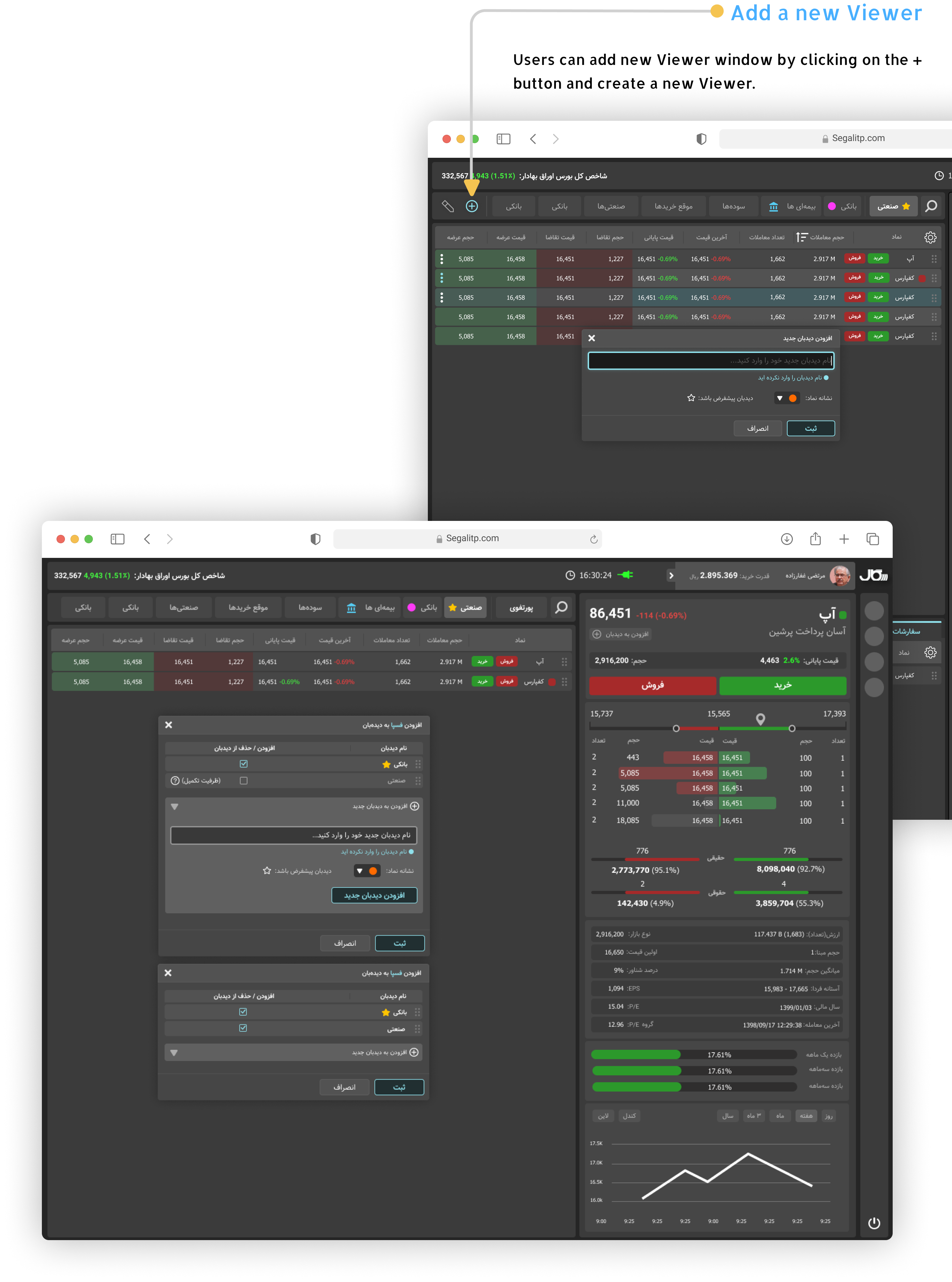
The Stock Viewer
Users should add their stocks to any viewer in this app in order to view their stock changes in this platform, Users can personalize their stocks, and viewers.
Search for a stock in a Viewer
Users can search for any stocks they have added to a viewer.
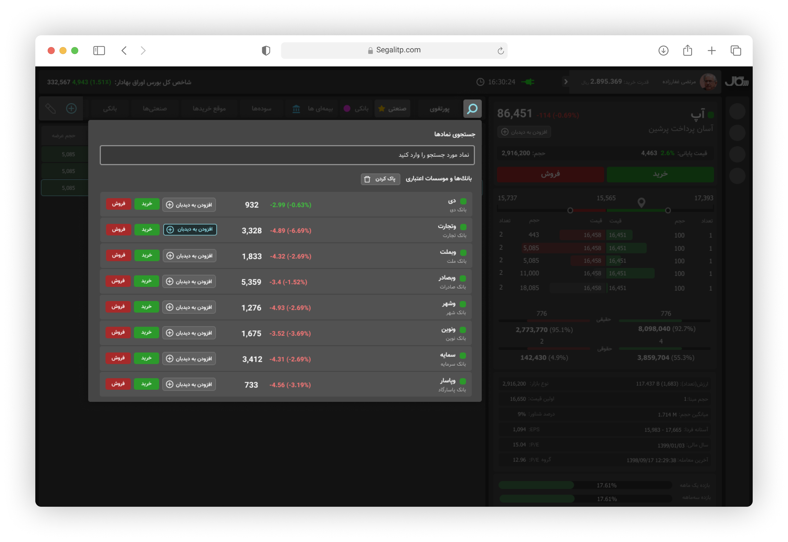
Sorting industrial Stocks and Searching
Users can add any stock to any viewer they have already created
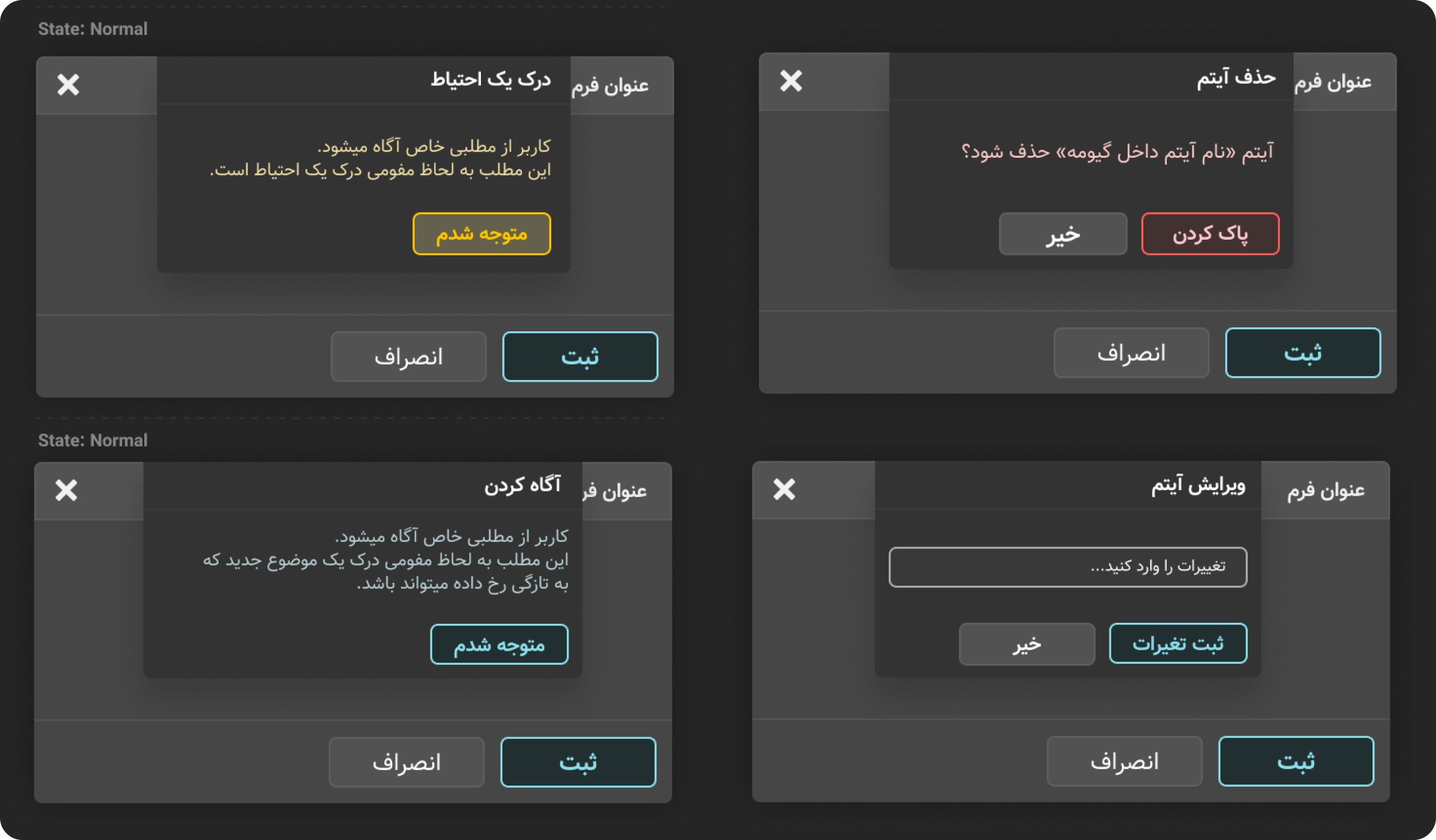
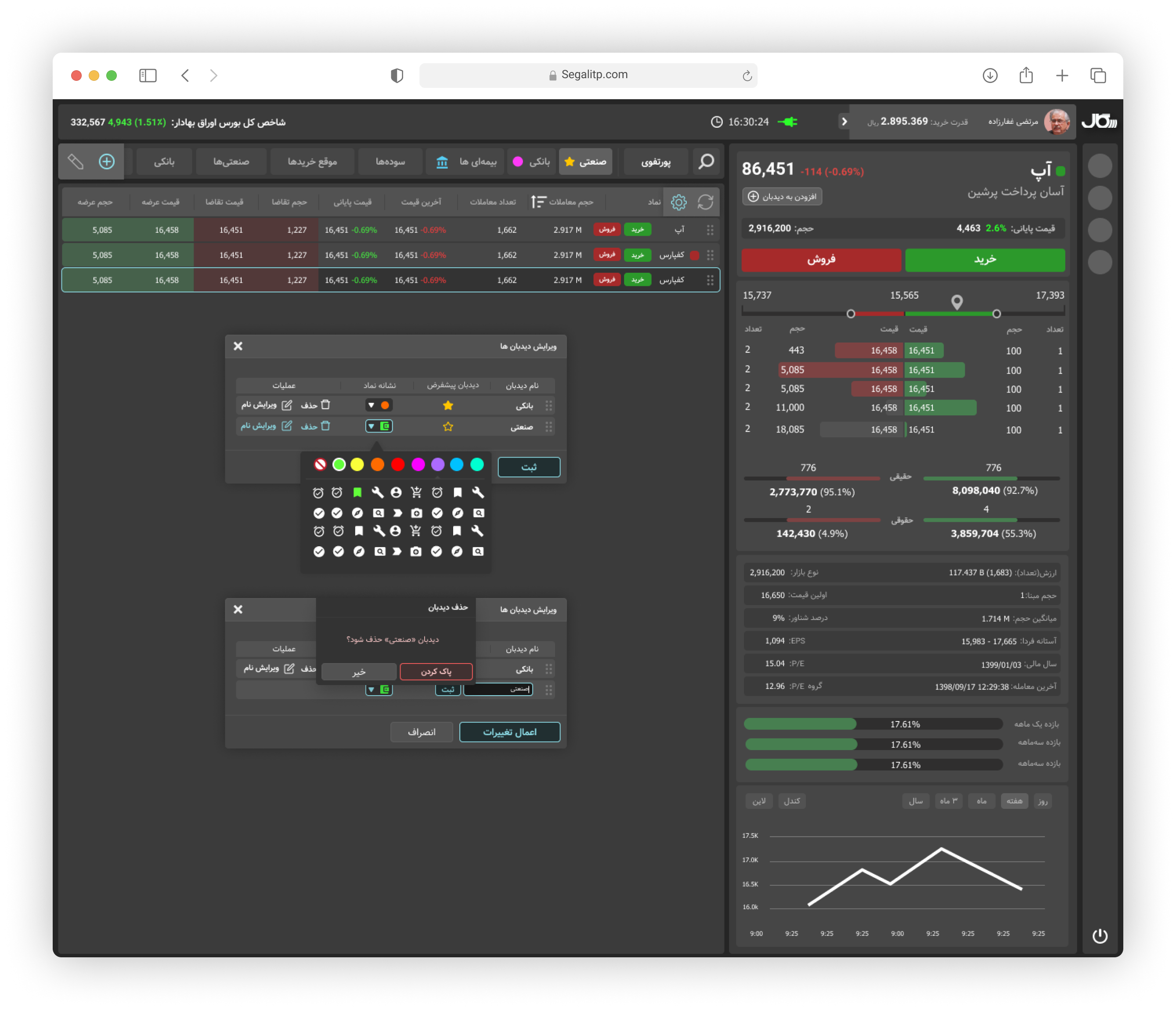
Edit Stocks Viewer
Users can edit any Viewer they have already created. They can also change viewer icon and make it the default viewer
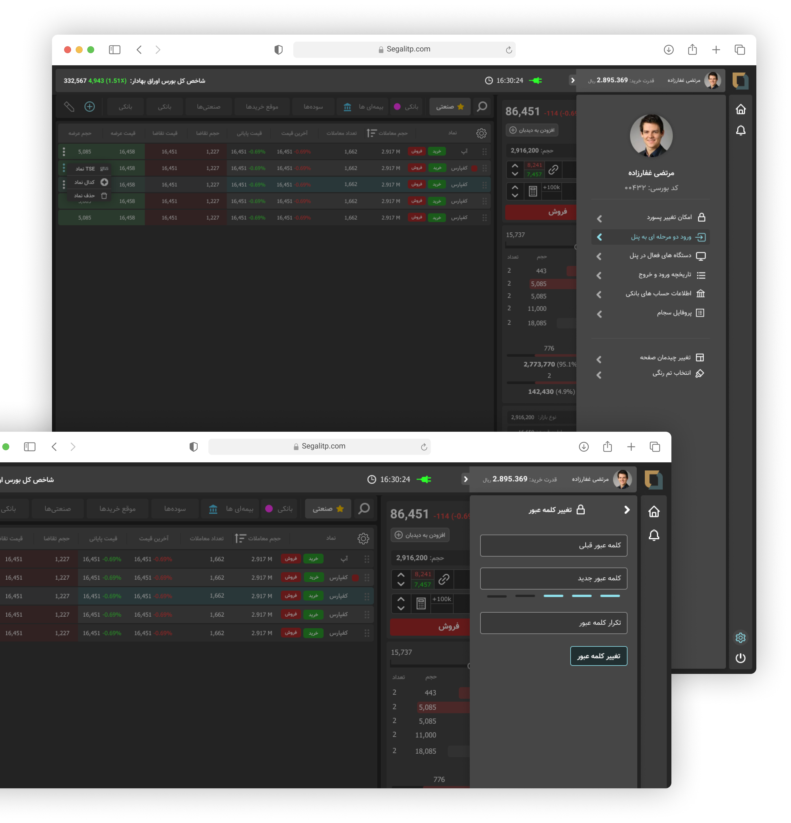
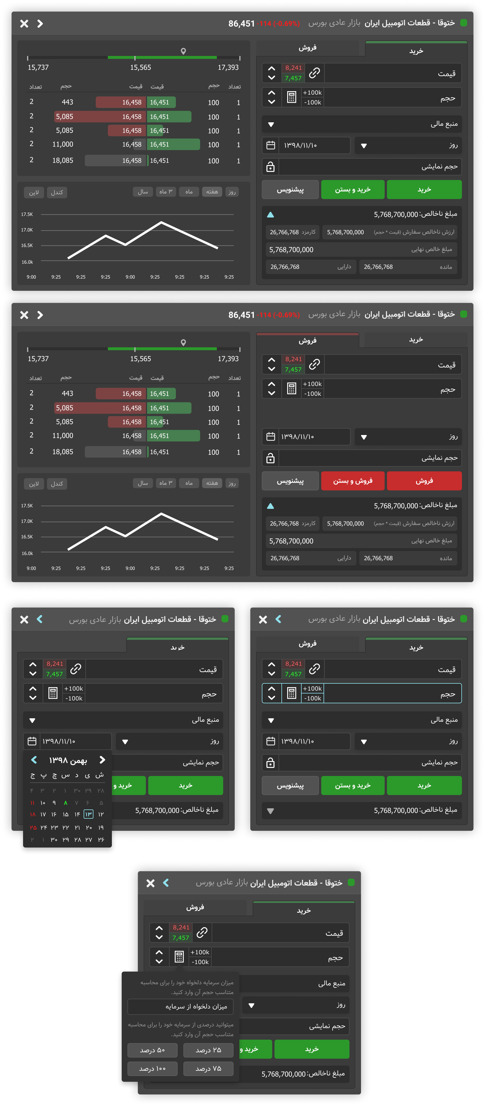
Buy and Sell Stocks: The Process and UI Design
Users can open the buy/sell stocks panel by clicking on a stock’s buy/sell button. Live data for each stock is shown, and the user can switch between the buy and sell sections by clicking the tab title.

User Profile Design
Users can access their profile information by clicking on their photo icon at the top. In this section, they can change their password, set 2-step verification, and see their login history. They can also change the theme from dark to light mode.