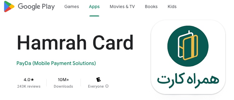
Product Overview
HamrahCard is a financial mobile app that offers banking services like money transfer and bill payment. As the lead product designer for one year, I was responsible for all aspects of the app’s UX design.
Design Scope
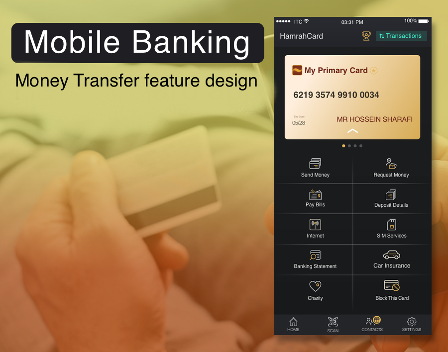
In this case study, the process of designing a “Money Transfer” feature in the HamrahCard fintech app is described. This app handles a couple of financial services, and by developing money transfer features in most fintech apps, this app needs to implement this feature as well in response to user demands.
The Problem
We have benchmarked the money transfer feature of our competitors’ apps, and the average Time-on-Task is two minutes. Reducing this parameter to one minute could significantly enhance our application, potentially increasing user retention and word-of-mouth advertising.
Team Members:
Hossein Sharafi: Lead Product Designer
Arta Mokaberi: UX Designer
Siamak Mokhtari UI Designer
Project Details:
Customer: HamrahCard app (a subsidiary of Ayandeh Bank)
Company: FarazPardazan Co
Date: June 2020
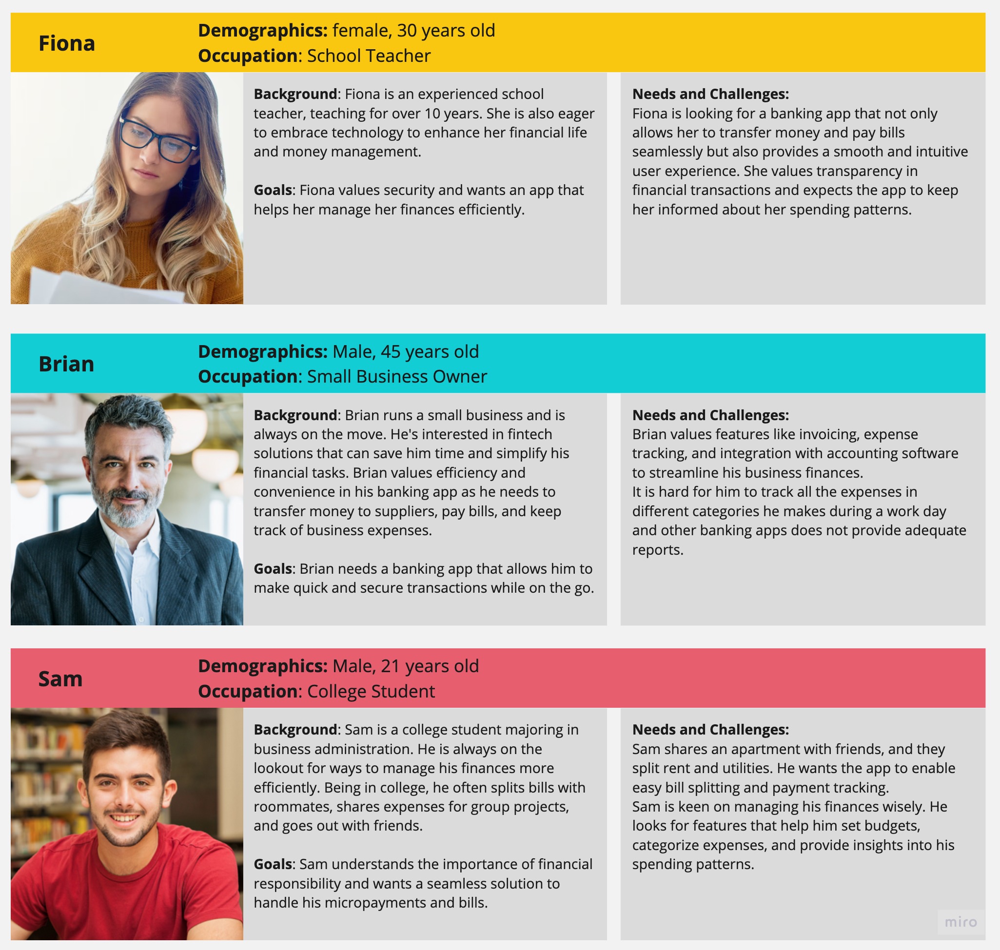
User Personas
Considering that this application has been in the market for several years, we have useful information about our users. We created the User Personas based on research and previous data from our in-site data analysis team.
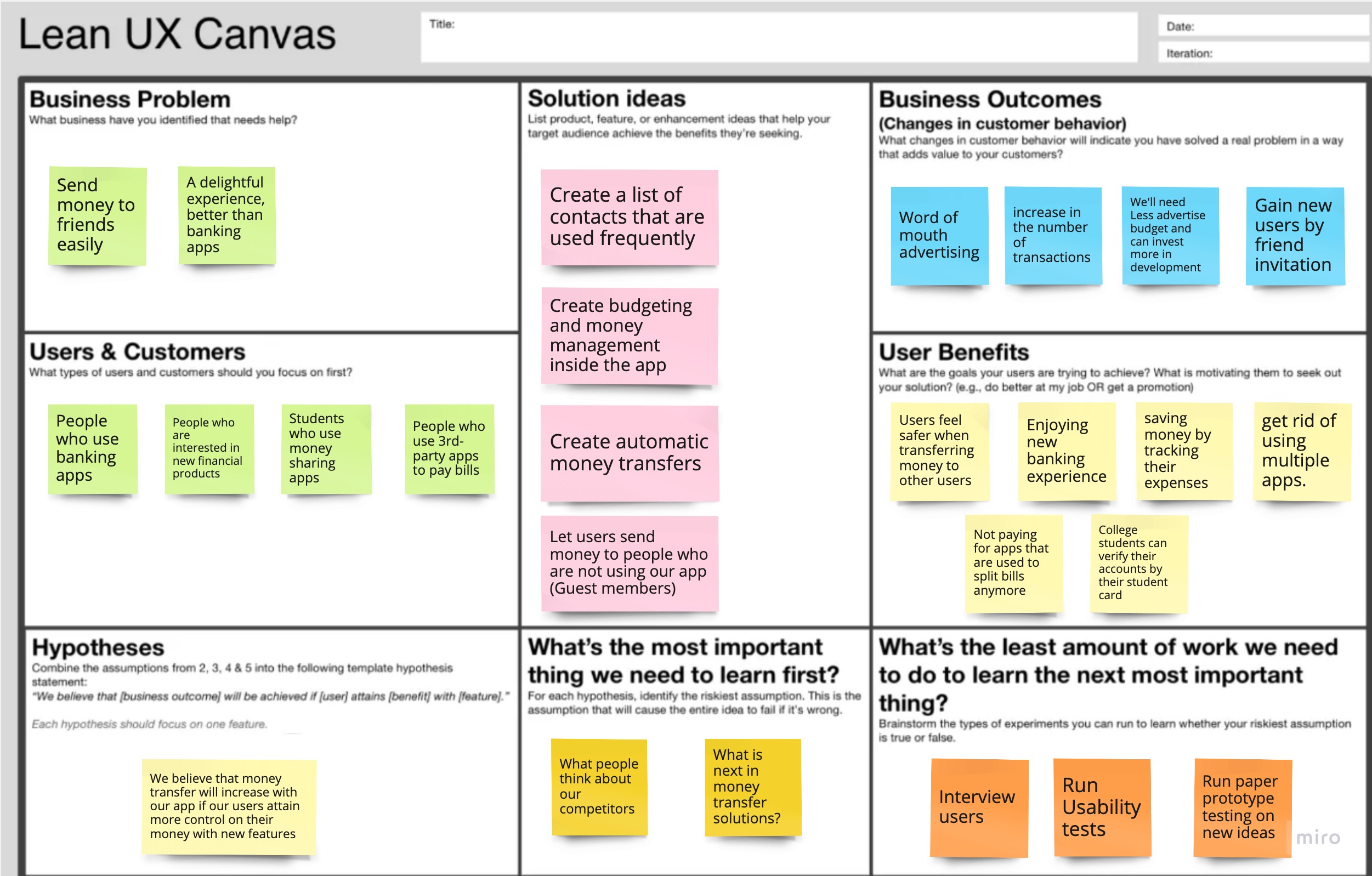
Lean UX Canvas
I outlined the app’s current state using the Lean UX Canvas and wrote down my assumptions about future development. Since this is a living document, I revisited it to make updates as I went through the Design Thinking Process.
User Research
Survey
As the first step in my user research, I conducted a 12-question survey. I spent some time carefully crafting my survey questions to reflect the data I needed at the start of my process because surveys have proven to be a helpful tool for capturing much quantitative data.
I distributed my poll over Twitter and a few Telegram Channels, and within a week, I received about 100 responses.
findings:
- About 30% of those surveyed claimed to use our app.
- 90% of those surveyed indicated they use at least one mobile app for their daily financial needs.
- The main use of a financial app is to check their bank account balance, and the second is to transfer money to other accounts.
- User-friendliness is the key factor for individuals when selecting a banking application.
User Interview
I conducted interviews with over ten users of at least one financial app, which yielded a wealth of insightful information.
Findings:
- Financial service preferences change depending on the age and income of users. Younger ones prefer faster user flow and interactions, while older ones prefer stable, understandable flow.
- Users cited that they are interested in the variety of services available on an app and prefer to install an app that offers more banking services.
- Some users have uninstalled apps because the user flow for transferring money was too complex, or the instructions were unclear, resulting in extended task completion times.
Affinity Map
I converted all my recorded interviews and survey results into digital sticky notes using Miro. After dropping all of my data onto sticky notes, I organized them onto my Affinity Map with themes and color-coded them by brands.

Some Key Findings
- Most of the data points were related to money transfers and lists of transactions.
- People prefer to use an app that supports more banks and financial institutes.
- People would prefer to be able to hide/remove some transactions from the list.
- People usually transfer money to people who are already in their contacts list.
- Transferring money is sometimes time-consuming due to copying and pasting different card numbers.
- Speed and Security are always important for the users.
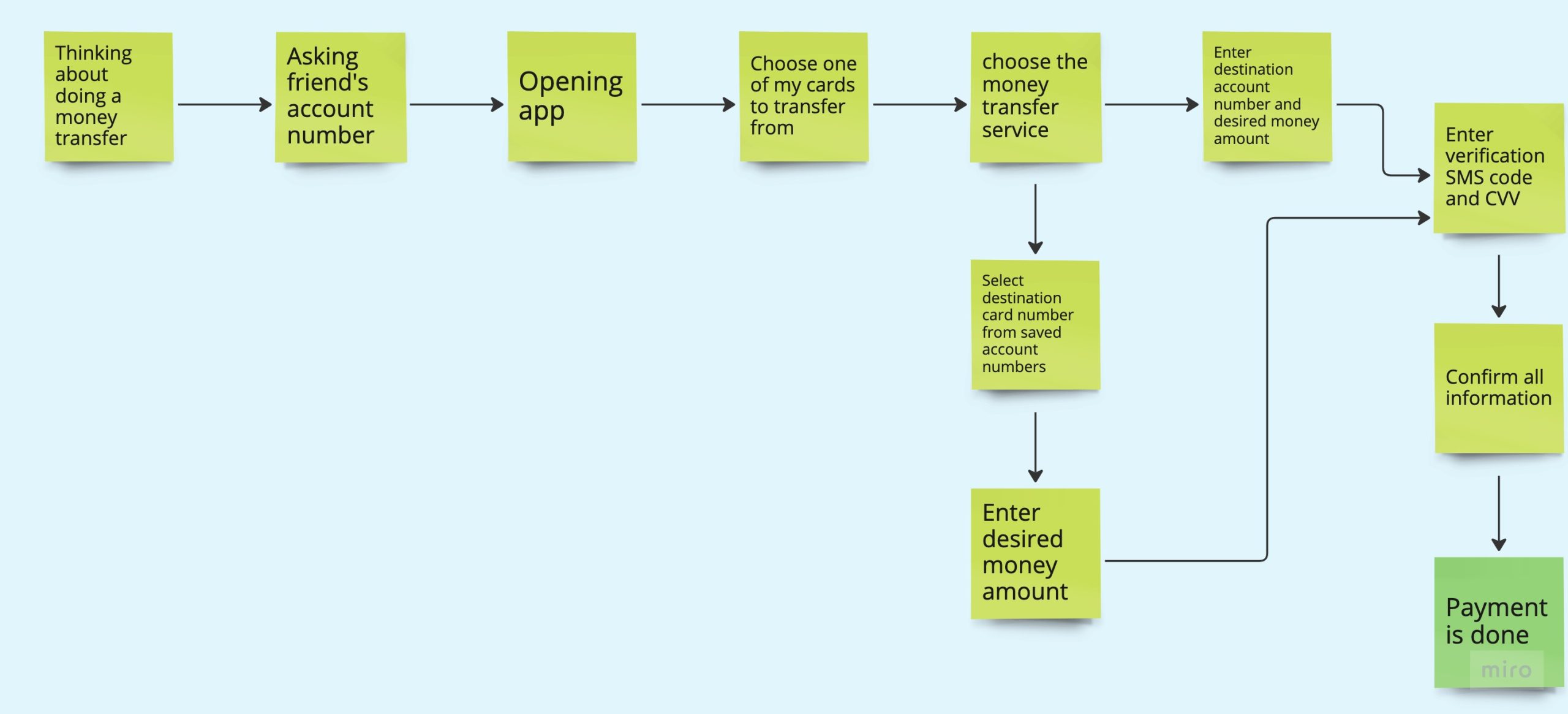
Task Analysis
Here, I’ve shared the money transfer task analysis. Although there are several different ways to transfer money on these apps, I used my interview data to choose the steps that users would usually take.
Proposing new Features in money transfer
Following a brainstorming session with stakeholders, design team members, and developers, we have decided to implement additional features to enhance the user-friendliness and speed of the money transfer process:
- Ability to choose destination email/phone number from user’s contacts list.
- Ability to read and fill the one-time password field automatically.
These two features help to expedite the process and reduce the amount of data entry required by the user.
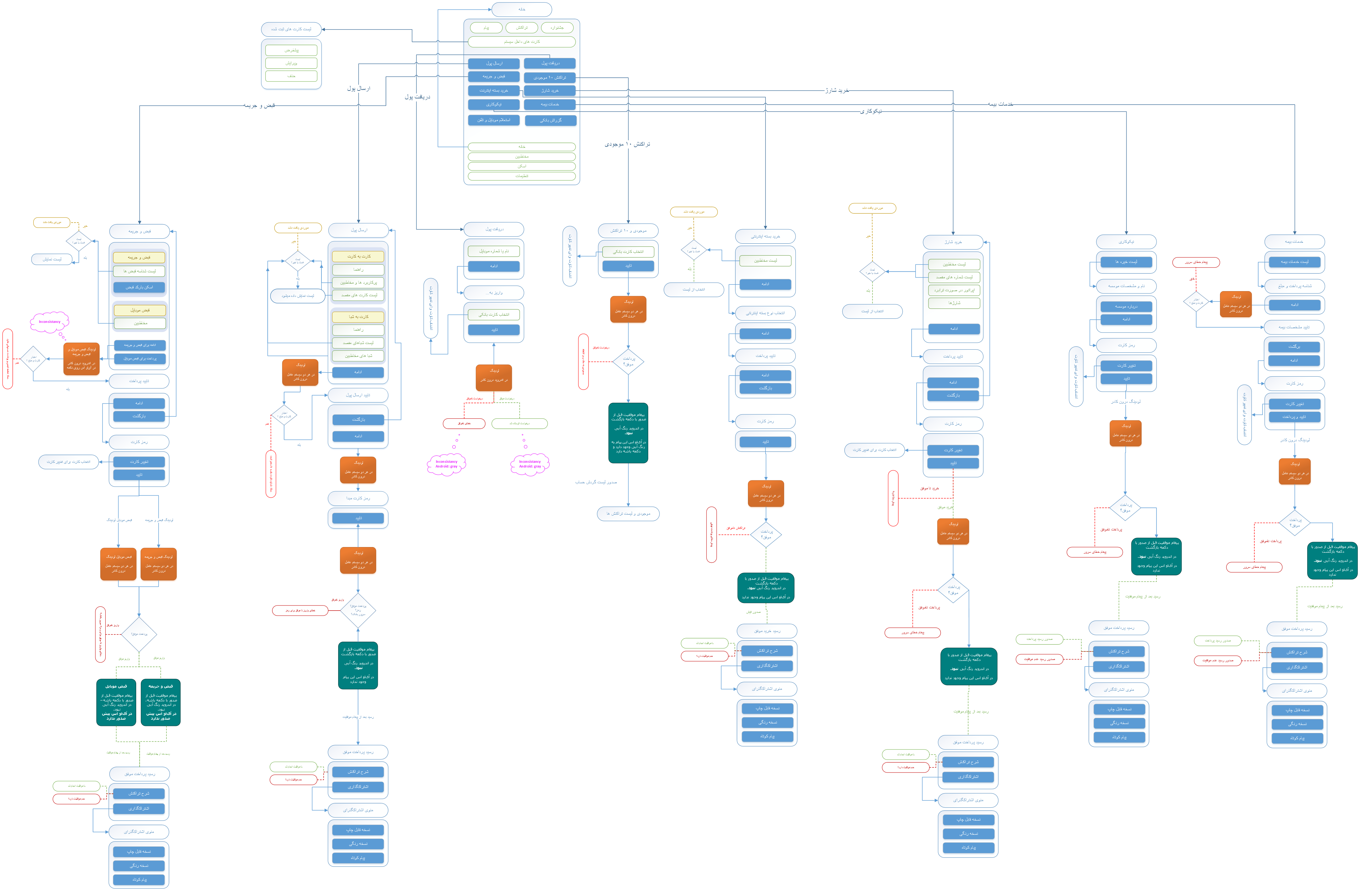
UserFlow of All Features
After extracting the task analysis, I had to describe the steps users take for a particular task as a user flow to ensure this process does not conflict with other application components and adheres to our design principles and language.
Low Fidelity Wireframes
Wireframes are designed based on the task analysis, User Flow, and this app’s design language. We could do usability testing on lo-fi wireframes to ensure the new design is intelligible to our users and satisfies their needs.
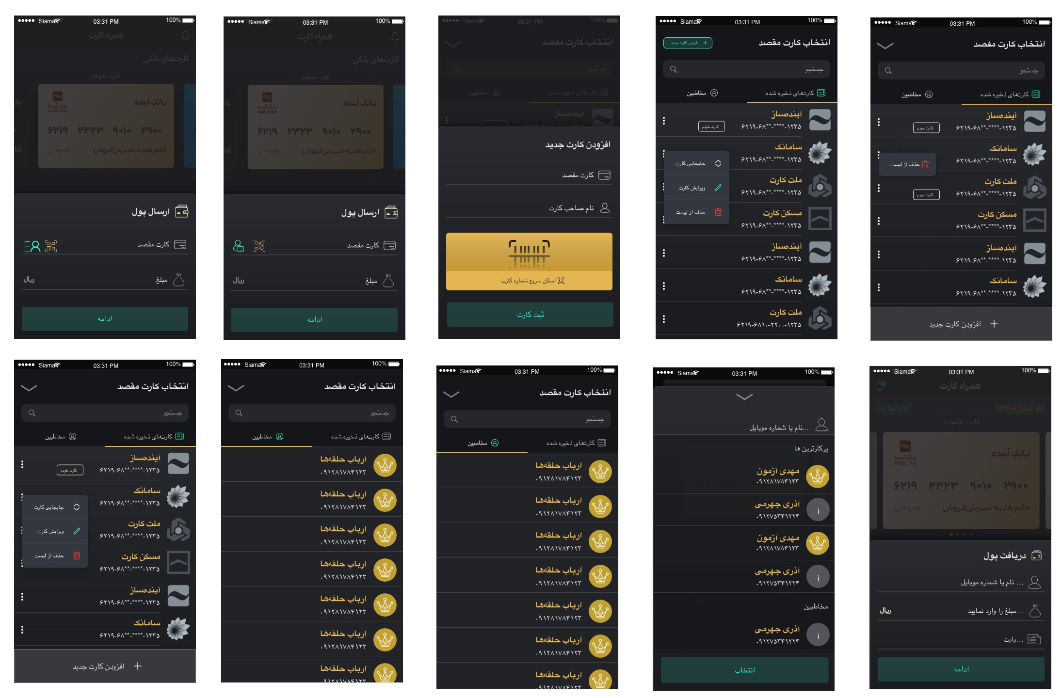
High Fidelity UI
The user interface of this section was designed based on the application design language and added to the app. The language of this version was Farsi, and its English version will be published soon.
Usability Testing
Following the implementation of this feature, we conducted another round of usability testing, to measure time on task and some other UX metrics.
Users can now transfer money in a minute (58 seconds), compared to the average of 2 minutes for money transfers in competing apps.
Measurable success
The smooth process is attracting more users, and we reached the rate of 4.0 and 10 million installs in Google Play.